SaaS Activation · Subscription CRO · Discovery-Led Redesign

Bluemeds — redesigning the calculator that unlocked subscription growth

How I identified a core activation failure in Bluemeds' prescription savings calculator, ran user discovery, shipped a redesign matched to patients' mental models, and turned a broken acquisition tool into a driver for both online and clinical sales.

Blue Medical — Bluemeds Guatemala March 2022 – May 2024 Program Manager GA4 · Hotjar · Power BI View live product ↗
2.1×
lift in visitor-to-quote conversion (1.5% → 3.2%)
↓ rage
frustration signals on calculator dropped after redesign
+Sales
calculator output became a tool for clinical sales team
Confidentiality note: Metrics are approximated to protect NDA obligations. Traffic volumes and conversion rates reflect real product data but are presented as ranges. All figures reflect real work on a live product.
Business context

Bluemeds is a recurring prescription medication delivery program for chronic patients — offering 20% savings on the medications they need to manage conditions like diabetes, hypertension, and chronic pain. The subscription model was the business's bet on reducing costly in-person sales while building predictable recurring revenue. The average monthly ticket exceeded $80 USD, making each activated subscriber significantly more valuable than a one-time purchase.

The opportunity
  • The proof of concept had been validated through contact center and in-clinic sales — demand existed, patients understood the value when explained in person.
  • Building a self-service digital platform could eliminate sales commissions, reduce operational costs, and scale the program without proportional headcount growth.
  • The 20% savings on medications patients depend on is a genuinely compelling value proposition — the product problem was not the offer, it was communicating and activating it digitally.
  • A working calculator would also empower the clinical sales team — giving doctors and sales reps a shareable, visual savings comparison for patient conversations.
The structural challenges
  • High product complexity: calculating medication savings requires dosage, frequency, medication type, pack size, and delivery timing inputs — a cognitive overload for patients who simply think "I take this pill every day."
  • Low traffic volume: initial daily sessions were under 100, growing to 200+ with paid investment — too low for statistically significant A/B testing, requiring qualitative-first discovery.
  • Misaligned acquisition: paid traffic was not directed at the right audience segment — chronic patients with $80+ monthly medication spend. Generic traffic produced low intent and low conversion.
  • Cost structure pressure: free delivery + medication costs + commissions meant each subscription needed to be correctly priced and operationally efficient. This created constraints on discounting and simplification.
Industry context: the global average e-commerce conversion rate is 2.5–3% (Statista, 2025). Starting below 1% on a complex subscription product with low-intent traffic is a recoverable gap — but requires fixing both the funnel and the traffic strategy simultaneously.
Funnel map
CRO stages: Acquisition (TOFU) → Activation (MOFU) → Conversion (BOFU)  ·  Primary metrics: Visitor-to-quote rate · Quote-to-subscription rate · Session duration · Rage click rate
1
Land on mibluemeds.com
<100 daily sessions initially · 200+ with paid investment
2
⚠ Search for medications
Users unfamiliar with product names or dosage formats
3
⚠ Build medication list
Dosage, frequency, pack size — high cognitive load
4
⚠ Use the savings calculator
Complex inputs · Confusing delivery date logic · Rage clicks
4+
✓ Redesigned calculator (this case study)
Smart defaults · Monthly framing · Simplified savings comparison
5
Generate quote
Baseline: 1.5% of visitors reached this step
6
Create account
Required before checkout — additional drop-off point
7
Delivery & billing information
NIT number required (Guatemala tax ID) — friction for some users
8
Subscribe ✓
Recurring monthly delivery activated
Strategic pivot note: As the digital funnel showed the depth of the activation challenge, the business made a rational strategic decision — shift primary acquisition toward in-clinic sales, where doctors could explain the product and handle the complexity in person. The digital platform was repositioned to support that strategy by giving the sales team a shareable, visual calculator output for patient conversations.
The experiment — calculator redesign
CRO stage: Activation (MOFU)  ·  Key signals: Rage click rate · Session duration · Quote generation rate · Drop-off step analysis
What the data showed
  • Hotjar rage clicks on the calculator — a clear behavioral signal of confusion and frustration, not intent to abandon. Users were trying to use the tool but failing.
  • Purposeless navigation patterns — users moving between fields repeatedly without progressing, indicating they didn't understand what was being asked of them.
  • GA4 funnel: visitor-to-quote conversion rate sat below 1.5% — far below the 2.5–3% e-commerce average, and catastrophically low for a product where the quote is the activation moment.
  • System event logs (Power BI): most sessions that started the calculator abandoned it before generating a quote. The completion rate was the primary bottleneck in the entire funnel.
🧠 Cognitive Load 🧠 Mental Models 🧠 Uncertainty Effect 🧠 Decision Fatigue
Root cause hypothesis
  • The calculator was designed around pharmaceutical logic (dosage units, frequency intervals, pack configurations) rather than patient mental models (I take one pill a day, I need a monthly supply).
  • The delivery date system produced outputs that patients didn't understand — showing scheduled delivery dates that felt arbitrary and created distrust rather than confidence.
  • There was no clear before/after price comparison that matched how patients thought about their spending — monthly cost vs. per-pill unit economics is not how chronic patients budget their medication.
Research context: cognitive load is one of the top conversion killers in complex product flows. Simplifying checkout to one page improves conversions by 17%; autofill-enabled fields boost form completion by 12% (CRO Statistics 2025, Marketing LTB).
Method: Customer interviews + usability observation  ·  Recruitment: Hotjar high-frustration sessions + GA4 drop-off segments
How we found the right users
  • Used Hotjar to identify sessions with high rage-click signals on the calculator — these were the users most likely to tell us what was wrong.
  • Used GA4 drop-off segments to identify users who had started the calculator flow but abandoned it before generating a quote.
  • Recruited from this segment for direct user interviews — patients who had tried and failed were more valuable than those who had never tried.
Key insights from interviews
  • Patients don't think in doses and frequencies. They think: "I take one of these every morning." Asking for dosage units and frequency intervals was a foreign language.
  • The delivery date logic created distrust. The system showed scheduled delivery dates that patients didn't understand how to interpret — some thought it meant they had to wait that long for their first order.
  • The savings comparison didn't match their budget frame. Showing per-unit price comparisons meant nothing. What mattered was: "How much do I spend per month today, vs. how much would I spend with Bluemeds?"
  • Elderly patients and caregivers were particularly affected. The primary target — chronic patients managing multiple medications — often had low digital literacy or were being assisted by family members.
Psychology principles at work
  • Mental Models (growth.design): users have preconceived ideas of how things work. The calculator violated patients' mental model of how they think about their medications — creating confusion instead of clarity.
  • Cognitive Load: total mental effort required peaked at the calculator — the exact moment we needed users to feel momentum, not friction.
  • Trust Erosion: the confusing delivery date output created doubt about whether the product would actually work as promised. Trust, once broken in a healthcare context, is hard to recover within the same session.
  • Curse of Knowledge (growth.design): the team building the calculator understood pharmaceutical terminology. The patients using it did not. This gap was invisible until we talked to users.
Why qualitative research mattered here: with under 200 daily sessions, quantitative testing alone could not surface the why behind the drop-off. User interviews were not a supplement to data — they were the primary discovery tool at this traffic volume.
Method: Prototype → Usability testing with target patients → Development → Pre/post measurement
Design principles for the redesign
  • Monthly framing as the default. All savings comparisons shown as monthly cost — matching how chronic patients actually budget their medications, not per-unit pharmaceutical logic.
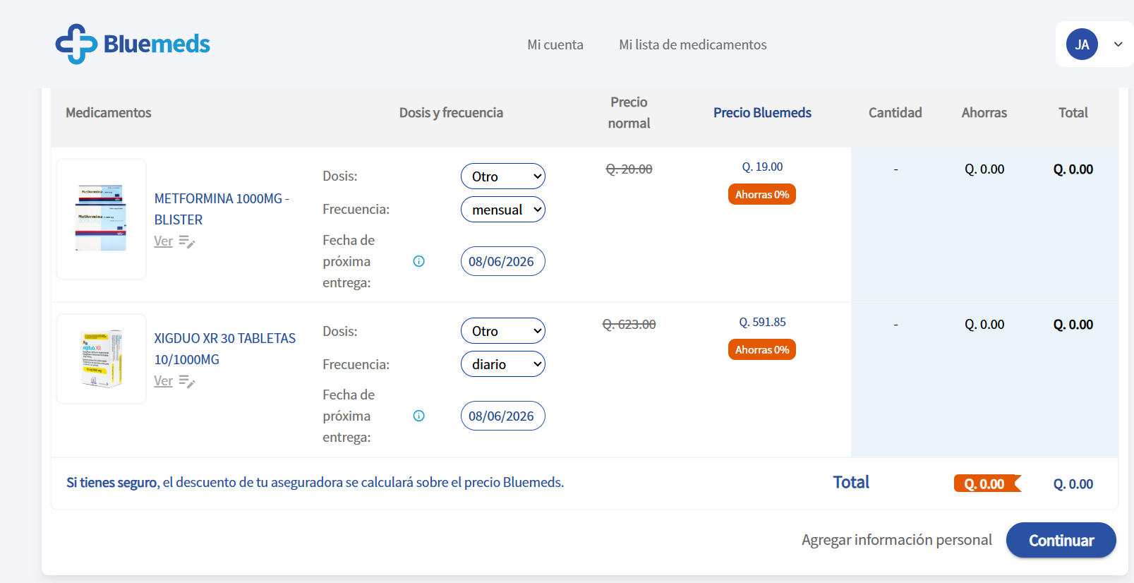
  • Smart defaults for common dosages. Pre-populate the most common dosage/frequency combinations for each medication — reducing required inputs from 4–5 fields to a confirmation tap.
  • Simplified delivery logic. Replace abstract scheduled dates with plain language: "Your medications arrive every month, starting [date]."
  • Clear before/after savings comparison. Show two numbers side by side: "What you pay today at a pharmacy" vs "What you'd pay with Bluemeds" — making the value proposition immediately obvious without calculation effort.
🧠 Progressive Disclosure 🧠 Recognition over Recall 🧠 Default Effect 🧠 Effort Heuristic 🧠 Anchoring
Usability testing before development
  • Built prototypes in Balsamiq matching the redesigned mental model — tested with target patients before any development began.
  • Usability tests confirmed users could navigate the redesigned flow to a quote significantly faster and with less hesitation.
  • Specific test tasks: "Find your medication, add it, and see how much you'd save per month." Success rate improved materially vs. the original flow.
  • Tested with elderly users and caregivers specifically — the highest-friction segment in the original discovery.
Psychology in depth
  • Default Effect (growth.design): users are strongly influenced by pre-set defaults. By setting monthly delivery and common dosages as defaults, we removed the need for most users to make any active decisions.
  • Anchoring: showing the pharmacy price first creates a high anchor. The Bluemeds price then feels significantly lower by comparison — making the value proposition land harder than showing the Bluemeds price alone.
  • Effort Heuristic: the perceived effort of using the calculator was the primary abandonment driver. Reducing inputs from 4–5 to 1–2 dramatically changed the effort calculus at the top of the tool.
Screenshot — prescription calculator
Bluemeds prescription calculator
Bluemeds savings calculator — redesigned with monthly framing, smart defaults, and clear before/after savings comparison
1.5%→3.2%
visitor-to-quote conversion rate
2.1×
lift in quotes generated per visitor
rage click rate on calculator — frustration signals dropped
What changed and why
  • Visitor-to-quote conversion more than doubled — from 1.5% to 3.2%. The redesign matched the patient's mental model, reducing the cognitive effort required to reach a quote.
  • Rage clicks on the calculator dropped — a behavioral signal confirming that frustration at the tool specifically was reduced, not just that fewer people were trying it.
  • Session duration and time on the calculator page increased — a positive signal indicating users were engaging more intentionally rather than bouncing in frustration.
  • Measurement: pre/post via GA4 and Hotjar across comparable time periods. No formal A/B framework — low traffic volume made statistical significance impractical within the program's pace.
Unexpected win — sales enablement
  • The redesigned calculator output — a clear monthly savings comparison — became a tool for the clinical sales team. Doctors and sales reps started sharing the quote output directly with patients during clinic visits.
  • This was unplanned. The insight came from the sales team, who recognized that the simplified, visual savings comparison was exactly what they needed for in-person patient conversations.
  • It turned the digital calculator from a pure self-service acquisition tool into a sales enablement asset — creating value in both the digital and clinical channels simultaneously.
Research context: checkout streamlining alone can produce up to 35% conversion lift (FERMÀT, 2025). Simplifying complex product flows to match user mental models is the highest-leverage intervention in subscription product CRO.
What I learned & what comes next
What I learned
  • Product complexity is a CRO problem, not just a UX problem. The calculator wasn't broken — it was solving the wrong problem. It was built for pharmaceutical operations logic, not patient mental models. Discovery revealed this; the redesign fixed it.
  • At low traffic volumes, qualitative research is your primary tool. We couldn't run A/B tests with statistical significance at our session volume. User interviews and Hotjar behavioral analysis were not supplements — they were the method.
  • The traffic problem and the conversion problem are separate. Even at 3.2% conversion, the absolute number of subscribers was constrained by low traffic. Both needed to be solved — fixing conversion without fixing acquisition only partially solved the business problem.
  • Design for your lowest-fluency user. Chronic patients, many elderly, with low digital literacy, were the primary target. Every simplification that worked for them also worked for everyone else. Designing up from the hardest case is the right approach.
What I'd do differently
  • Fix the traffic targeting first. Generic paid traffic to a complex subscription product is a waste. Targeting chronic patient profiles specifically — or partnering with clinic referral flows — would have improved both volume and intent before the calculator was even opened.
  • Build the A/B testing infrastructure earlier. Even at low volume, having the infrastructure in place allows incremental learning over longer windows. Waiting for volume before building the test framework is the wrong sequence.
  • Involve the clinical sales team from the start. The discovery that the calculator output was useful in clinical conversations happened by accident. It should have been designed for dual use — digital and in-clinic — from the first prototype.
Roadmap at departure
  • Better market price comparison — showing real pharmacy prices for each medication to make the savings comparison credible and verifiable, not just estimated.
  • Product photography and imagery improvements — the platform lacked visual trust signals for unfamiliar medications.
  • Social proof and reviews — critical for a healthcare subscription product where trust is the primary conversion driver.
  • Caregiver flow — designing specifically for family members managing medications for elderly parents, a significant and underserved segment of the target market.
Sources
Growth.Design — 106 Cognitive Biases
growth.design/psychology
Principles cited: Cognitive Load, Mental Models, Curse of Knowledge, Default Effect, Anchoring, Progressive Disclosure, Recognition over Recall, Effort Heuristic, Trust Erosion, Decision Fatigue, Uncertainty Effect.
CRO Statistics 2025 — Marketing LTB
marketingltb.com/blog/statistics/conversion-rate-optimization-cro-statistics
Simplifying checkout improves conversions by 17%. Autofill fields boost form completion by 12%. Average e-commerce cart abandonment: 69.4%. Showing total cost earlier reduces abandonment by 19%.
Ecommerce CRO Guide — Build Grow Scale 2025
buildgrowscale.com/conversion-rate-optimization-ecommerce-guide-2
Checkout streamlining can produce up to 35% conversion lift (FERMÀT, 2025). Global average e-commerce conversion rate: 2.5–3% (Statista, 2025). Simplifying complex product flows to match user mental models is the highest-leverage CRO intervention.
Pharmaceutical CRO — Cardinal Digital Marketing 2025
cardinaldigitalmarketing.com/healthcare-specialties/pharmaceutical-agency/cro
Trust and clarity are the primary conversion levers in pharmaceutical and healthcare e-commerce. Removing unnecessary steps and designing for patient mental models drives the highest conversion improvements in the sector.