Heuristic Funnel Audit · External Evaluation

HeartStamp — full funnel audit & experiment backlog

An external CRO evaluation of HeartStamp's web and mobile experience across the full purchase journey: landing, activation, checkout, and payment.

June 2026 heartstamp.com AI greeting cards · DTC · E-commerce Desktop + Mobile Baymard · Growth.Design · Fullstory
Methodology note: This is a heuristic evaluation conducted as an external observer with no access to internal analytics. All friction points are observed through direct product usage and cross-referenced with industry benchmarks. Every hypothesis requires validation before being prioritized in a real experiment backlog.

What this audit represents is the first layer of what should be a comprehensive optimization program — one that combines: qualitative user research (customer interviews, usability testing, expert heuristic evaluations); quantitative analysis (GA4 funnel data, Hotjar session recordings and heatmaps, behavioral analytics); market analysis (competitive benchmarking, industry research); and business understanding (strategic objectives, OKRs, revenue and cost structure, operational dependencies). With those inputs, a properly sourced optimization area map feeds a rigorous experiment backlog — where every hypothesis has an evidence source, a defined metric, and a stated priority rationale. What you see here is that backlog's starting point, not its final form.
Executive summary

HeartStamp has built something genuinely differentiated — an AI-assisted card creation experience that is emotionally engaging, visually impressive, and well-branded from end to end. The product delivers on its promise: the generated cards are beautiful, the conversational flow is clever, and the brand voice is warm and distinctive. These are hard things to get right, and HeartStamp gets them right.

The opportunity lies in removing friction between that strong product and the purchase. Three specific points in the funnel are likely responsible for the majority of conversion loss: a mandatory account wall that appears immediately after the user's most emotionally invested moment, a shipping cost reveal that creates a 50% price shock late in checkout, and the absence of Apple Pay for a US-first audience that skews heavily toward iPhone. Each of these is fixable without rebuilding the product — they are sequencing and surfacing decisions, not feature gaps.

⚠ Step 3
Account wall — highest severity. Blocks the funnel after peak emotional investment.
50%
Price increase perceived by users when shipping is revealed at checkout step 2.
8 tests
Prioritized experiments across acquisition, activation, checkout, and retention.

Analysis

CRO stage: Awareness → Interest  ·  Key metrics: Bounce rate · Scroll depth · CTA click-through rate · Session-to-chat-start rate
What's working well
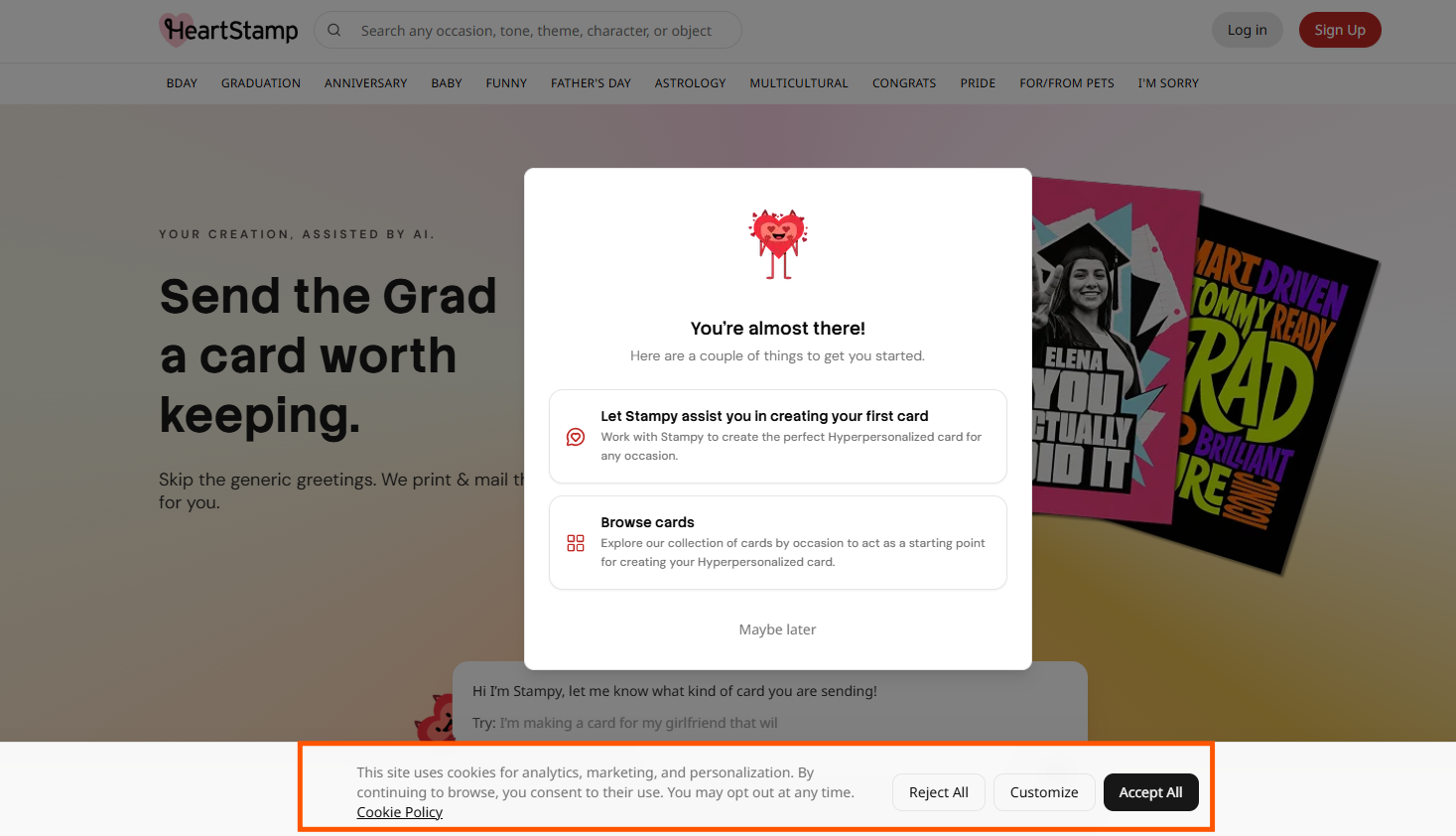
  • The category navigation bar (BDAY, GRADUATION, ANNIVERSARY…) immediately communicates the product's breadth and occasion-driven model — a strong orientation signal for new visitors.
  • The hero copy ("Snap a selfie, try it on your phone or laptop, no artistic skills needed") is clear, benefit-led, and addresses the #1 objection (effort) upfront.
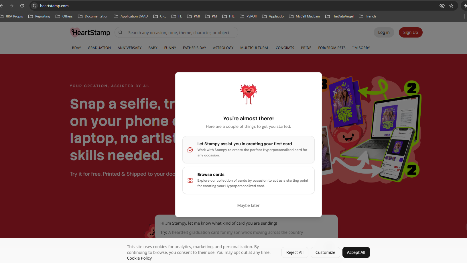
  • The onboarding modal offers two clear paths ("Let Stampy assist you" vs "Browse cards") — structured choice reduces paralysis for users who don't know where to start.
  • Stampy's character and brand voice are distinctive and warm — rare in e-commerce, and well-aligned with the product's emotional positioning.
Friction points observed
  • Three competing elements appear simultaneously on load: cookie banner (bottom), onboarding modal (center), and Stampy chat (partially visible below). The hero — the product's core value proposition — is blocked before the user has seen it.
  • The cookie banner could not be easily dismissed during testing, creating persistent visual noise at the most critical 5-second window.
  • The onboarding modal asks users to choose a path before they've seen the product — a decision without context.
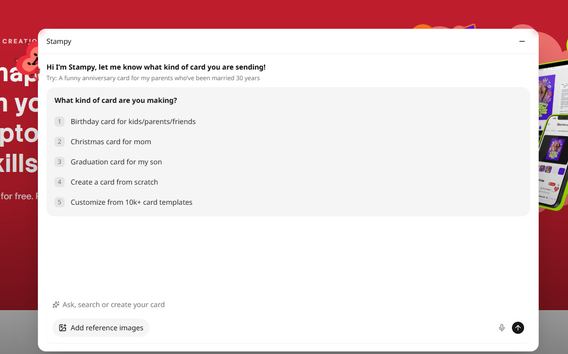
  • Stampy's chat widget looks like a UI decoration rather than the primary conversion entry point. No visual affordance signals it's interactive.
Psychology principles activated
  • Cognitive Load — Total mental effort required peaks at arrival. Three competing elements maximize it when it should be near zero.
  • Visual Hierarchy — High-weight elements (red modal, black cookie banner) compete with the primary CTA, breaking the intended eye-tracking path.
  • Signifiers (Norman) — The Stampy chat has no visual cue that it's interactive. No cursor affordance, no animation, no invitation signal.
  • Uncertainty Effect — Users who can't immediately understand "what do I do here?" apply a default exit heuristic.
What I'd confirm with internal data
  • Bounce rate on landing (GA4) — what % of sessions end with zero interaction?
  • Hotjar heatmap of the first viewport — where do users click first: modal, chat, or category bar?
  • % of sessions where the modal is closed vs a path is selected
  • Session-to-chat-start rate — how many visitors actually engage with Stampy?
  • Mobile vs desktop bounce rate split
CRO stage: Interest → Consideration  ·  Key metrics: Chat completion rate · Drop-off step in conversation · Time-to-"Create Card" click · Suggested response click rate
What's working well
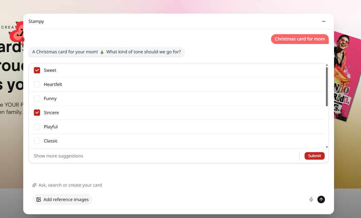
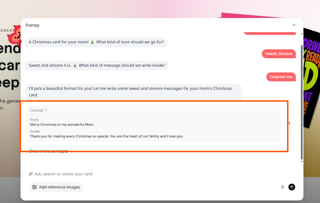
  • The conversational flow (occasion → tone → message) is genuinely clever — it reduces the blank canvas problem and guides users to a result without requiring design skills.
  • The "Surprise me" option is a strong UX pattern — it removes decision paralysis for users who feel overwhelmed by choices.
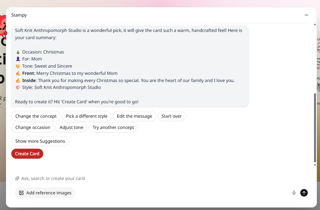
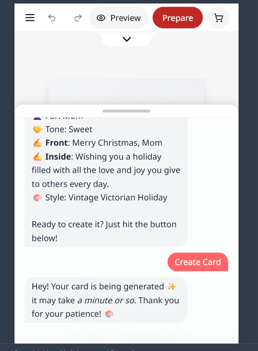
  • The concept summary (Occasion, For, Tone, Front, Inside, Style) shown before card creation sets clear expectations and lets users correct before committing AI credits.
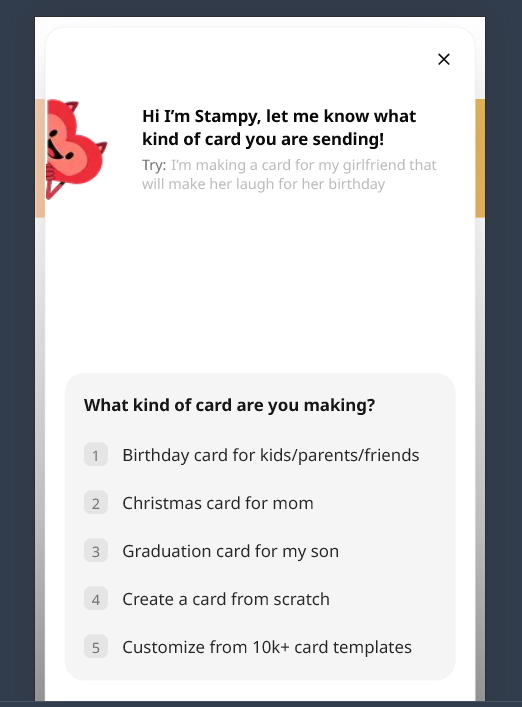
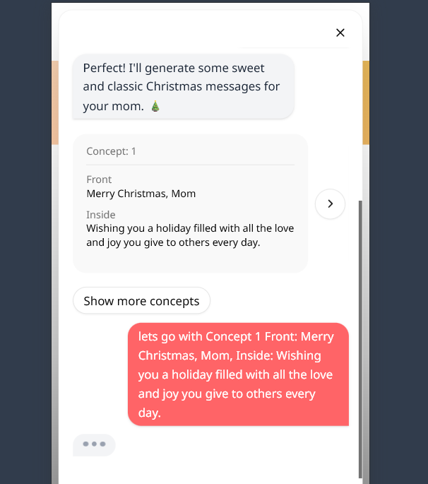
  • Mobile version uses a numbered list (1–5 options) that is more legible and clearly interactive than the desktop pill buttons.
Friction points observed
  • Response options ("Sweet; Sincere", "Surprise me") are styled as pink text pills — they do not visually read as buttons. During testing, these were not immediately recognized as interactive elements.
  • "Concept" cards showing Front + Inside message appear as static text blocks, not selectable items. There is no visible "Use this concept" CTA.
  • No progress indicator anywhere in the flow. The user has no sense of how many steps remain before seeing their card.
  • The "Create Card" button appears at the bottom of the Stampy panel after confirmation — easy to miss if the user hasn't scrolled.
Psychology principles activated
  • Affordance / Signifiers — Elements must communicate how they're used. A button styled as plain text breaks the user's interaction model and causes hesitation.
  • Goal Gradient Effect — Motivation increases as users feel closer to their goal. Without a progress indicator, users don't know how close they are to their card, suppressing this effect.
  • Progressive Disclosure — The chat does this well conceptually, but invisible affordances break the execution.
  • Uncertainty Effect — "Am I doing this right?" creates hesitation that compounds with each ambiguous step.
What I'd confirm with internal data
  • Drop-off rate at each Stampy question (GA4 event funnel) — which step loses the most users?
  • Click rate on pill options vs manual text input — are users ignoring the suggested responses?
  • Session recordings of users who exit during chat — do they show hover hesitation on pills?
  • Average time from chat start to "Create Card" click — long times may signal confusion
CRO stage: Consideration → Intent (blocked)  ·  Key metrics: Account wall completion rate · Drop-off at signup · Checkout abandonment attributed to forced registration · Email capture rate
Friction point — critical severity
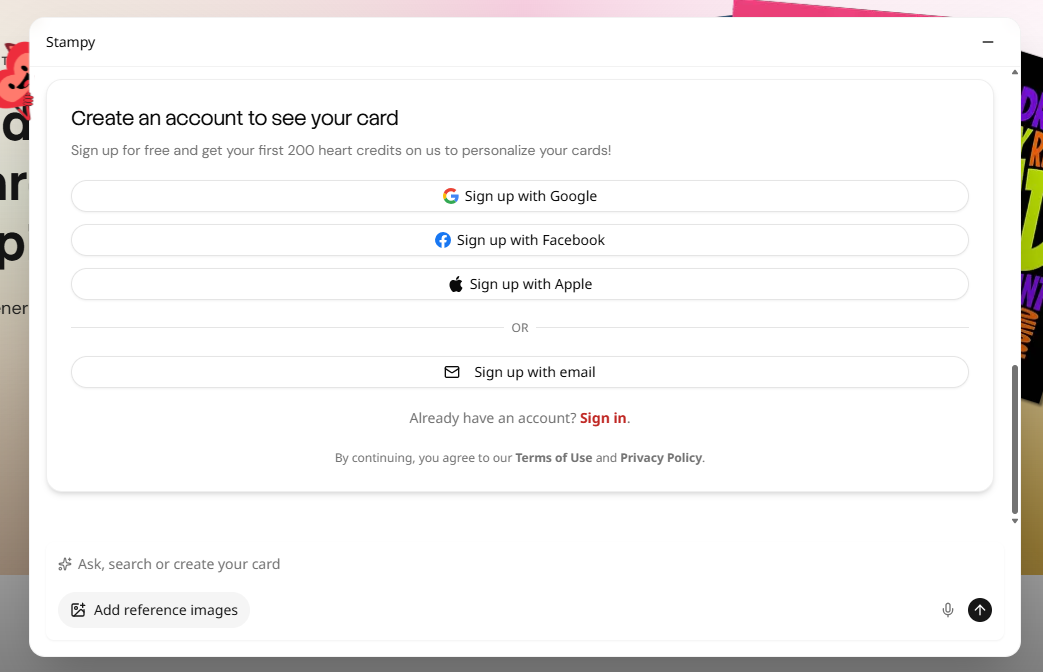
  • After completing the full Stampy conversation — investing 2–3 minutes choosing occasion, tone, and message — users hit a mandatory account creation screen before seeing their card design.
  • The screen presents four signup options (Google, Facebook, Apple, email) with zero guest path. There is no "continue without account" option.
  • The value incentive ("Sign up for free and get your first 200 heart credits") arrives after the friction — it reads as a consolation prize rather than a compelling reason to sign up.
  • On mobile, this step requires typing credentials on a virtual keyboard mid-flow — maximum friction at the highest-intent moment in the funnel.
Psychology principles activated
  • Sunk Cost Fallacy — Users who invested 2–3 min feel they'll "lose" their card if they exit. This partially mitigates abandonment, but not enough for users under time pressure.
  • Reactance — Users resist behaviors when they feel forced. "Create an account to see your card" is coercive framing that triggers resistance in privacy-conscious users.
  • Loss Aversion — The perceived loss of the created design can push some users through, but it creates negative brand association even when successful.
  • Expectation Bias — Users expect to see their output immediately after completing a creation flow. An interruption here violates a deep UX contract.
Revenue impact estimate
24–26%
of checkouts abandoned due to forced account creation (Baymard, 2025)
~$285K
estimated annual recoverable revenue at 1,000 daily sessions, $10.49 AOV, 30% recovery
Zero dev
guest checkout requires no new features — only deferred account creation logic
All estimates are illustrative. Actual upside requires real session volume and drop-off rate from GA4.
What I'd confirm with internal data first
  • Exact drop-off rate at the account creation screen (GA4 funnel step)
  • % of users who start signup but don't complete it
  • Mobile vs desktop split in this drop-off
  • Which signup method (Google/Apple/email) is most used
  • Average time on screen before abandonment (Hotjar)
  • Session recordings: where exactly do users exit?
CRO stage: Intent → Desire  ·  Key metrics: "Prepare for Cart" click rate · Preview click rate · Time in editor · Edit rate vs direct checkout
What's working well
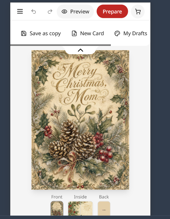
  • The generated card quality is genuinely impressive — the AI output is the product's strongest selling point and it delivers.
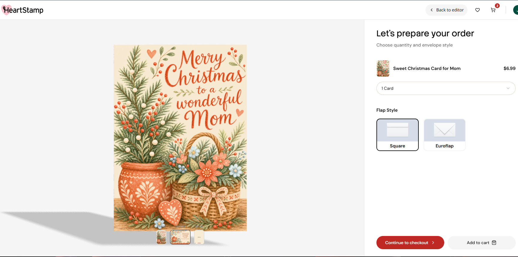
  • Front / Inside / Back thumbnail tabs let users review the full card before purchasing — reducing buyer anxiety about the physical product.
  • The "Preview" mode (fullscreen, clean) is excellent when found — it shows the card as it would actually feel to receive.
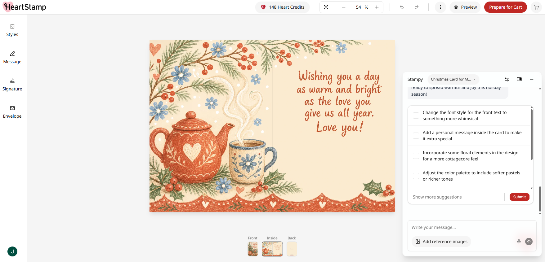
  • Improvement suggestion checkboxes provide an easy path to iteration without requiring users to know what to ask for.
Friction points observed
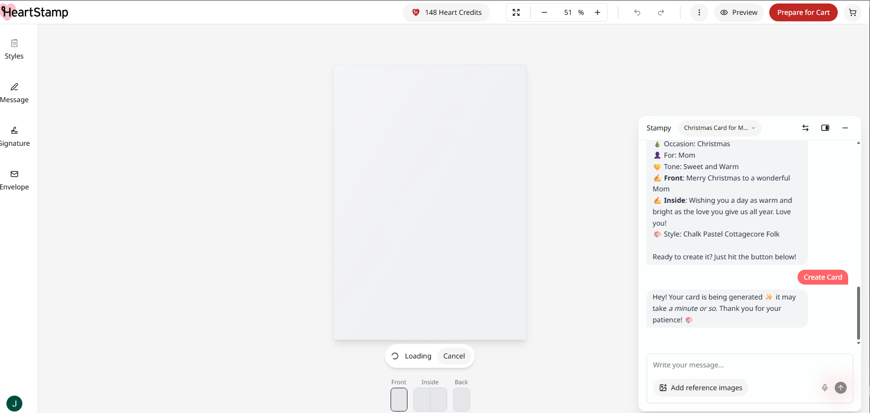
  • During generation, a blank white canvas with a "Loading / Cancel" button creates a dead wait — no progress animation, no sense of what's being created.
  • After generation, the card appears at ~54% zoom in a busy editor UI — not an inspiring first impression of a genuinely beautiful result.
  • The "Preview" button is low-prominence. During testing the chat panel was accidentally hidden with no obvious way to recover it.
  • Four improvement suggestions appear as checkboxes simultaneously — choice overload at the moment users should feel "I love this, let me buy it."
Psychology principles activated
  • Peak-End Rule — People judge experiences by their emotional peak. The card reveal IS that peak. Showing it small and surrounded by UI chrome mutes the impact that should drive purchase intent.
  • Aesthetic-Usability Effect — Beautiful designs are perceived as easier to use. A full-bleed preview maximizes this; a 54% editor view does not.
  • IKEA Effect — Users value things more when they partially created them. The editor leverages this correctly — but the underwhelming reveal undercuts the payoff.
  • Choice Overload — Four simultaneous suggestions introduce decision fatigue exactly when users should feel confident and ready to buy.
What I'd confirm with internal data
  • Click rate on "Preview" vs "Prepare for Cart" directly
  • % of users who make edits vs proceed directly to checkout
  • Time on editor page — are users engaged or just clicking through?
  • Click rate on improvement suggestion checkboxes
  • Hotjar scroll behavior: do users scroll to see suggestions?
CRO stage: Purchase  ·  Key metrics: Checkout completion rate · Drop-off by step (Address → Shipping → Payment) · Cart abandonment rate · AOV · Mobile form completion rate
What's working well
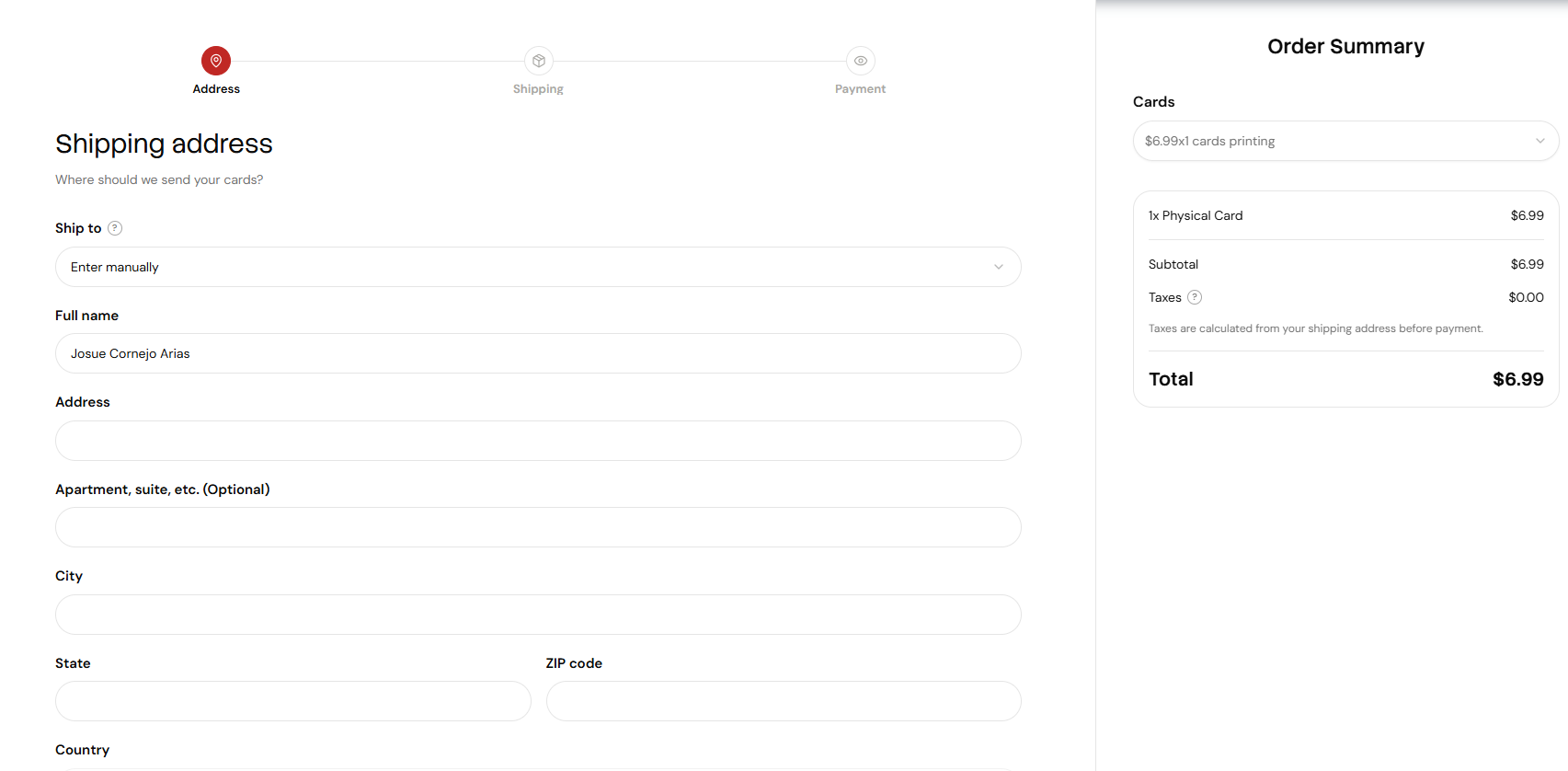
  • 3-step progress bar (Address → Shipping → Payment) sets clear expectations for checkout length — a best practice that reduces anxiety.
  • Order summary is persistent on the right throughout checkout — users always see what they're buying.
  • The "Back to editor" link lets users refine their card without losing progress — a thoughtful trust signal.
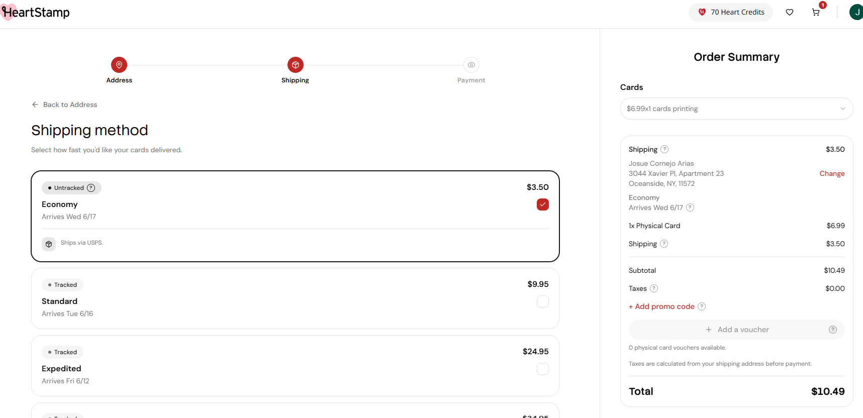
  • Delivery date is shown per shipping option (e.g., "Arrives Wed 6/17") — specific dates outperform vague "3–5 business days" language.
Friction points observed
  • Shipping cost ($3.50) is not revealed until Step 2. The order summary on Step 1 shows Total: $6.99. On Step 2 it jumps to $10.49 — a perceived 50% price increase on the user's mental anchor.
  • The "Ship to" dropdown defaults to "Enter manually" — no autofill. On mobile, 6 address fields via virtual keyboard is significant friction at a critical moment.
  • The cheapest option is labeled "Untracked" — for a sentimental physical product, this creates delivery anxiety that may push users toward upgrading or abandoning.
  • No estimated delivery date is shown on the Address step — users with time-sensitive occasions have no confidence signal at this point.
Psychology principles activated
  • Anchoring — The user's price reference is anchored at $6.99. The $10.49 reveal creates a disproportionately negative reaction relative to the $3.50 absolute difference.
  • Pain of Paying — Concentrated fee revelation at the final decision point makes the pain of payment more acute than if costs were shown earlier.
  • Loss Aversion — Unexpected costs feel like losing money, not spending it. The late reveal triggers this more sharply than transparent upfront pricing would.
  • Trust Erosion — "Untracked" shipping for a sentimental card conflicts with the product's emotional positioning and introduces doubt late in the funnel.
What I'd confirm with internal data
  • Drop-off rate between Address and Shipping steps (GA4) — this is where the price reveal hits
  • Shipping option distribution — % choosing Economy vs upgrading vs abandoning
  • Mobile vs desktop abandonment rate specifically at the shipping step
  • Hotjar scrollmap on address form — where on mobile do users drop off?
  • Time on Shipping step — long dwell may indicate price shock hesitation
CRO stage: Purchase completion  ·  Key metrics: Payment completion rate · Payment method distribution · Mobile payment conversion rate · AOV with upsell
What's working well
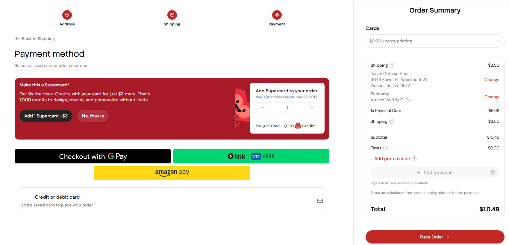
  • Google Pay is present — fast one-tap checkout for Android users with no manual entry required.
  • Link (Stripe) auto-populates saved card information — frictionless for returning users who've checked out anywhere with Stripe before.
  • Amazon Pay provides an additional trust signal for users comfortable with Amazon's checkout experience.
  • The "Supercard" upsell (+$3 for 5× Heart Credits) is a well-framed AOV experiment with clear value and well-applied loss aversion copy.
Friction points observed
  • Apple Pay is absent. For a US-first product targeting millennial moms and Gen-Z — both demographics with very high iPhone usage — this is a significant gap at the final conversion step.
  • Apple Pay holds ~49–57% of the US mobile wallet market and ~65.6M active US users in 2025. It accounts for 54% of all in-store mobile wallet taps and over 14% of online consumer payments.
  • For HeartStamp's core audience, the absence of Apple Pay means highest-intent users on the highest-converting device face the highest-friction alternative: manual card entry.
Psychology principles activated
  • Familiarity Bias — Users prefer familiar payment methods. iPhone users with Apple Pay expect to see it and experience friction — consciously or not — when it's absent.
  • Effort Heuristic — One-tap native payment removes virtually all remaining checkout friction. Manual card entry is the highest-effort alternative at the lowest-patience moment.
  • Decoy Effect — The Supercard upsell (+$3) is well-positioned as a clear value add relative to the base card price.
What I'd confirm with internal data
  • Device type breakdown of users reaching checkout — what % are on iOS? If >40%, Apple Pay becomes Tier 1.
  • Mobile vs desktop payment completion rate split (GA4)
  • Payment method distribution — how many attempt manual card entry and abandon?
  • Supercard upsell acceptance rate — helping AOV or creating hesitation?

Experiments

🔴 Tier 1 — Ship in week 1
EXP-001 Deferred account creation — guest path to checkout Critical
Hypothesis: if users can see their card and reach checkout without creating an account, checkout completion rate will increase by ≥10% — removing the #1 conversion killer (Baymard: 24–26% of abandonments) amplified by the emotional sunk cost of having created the design.

Variant: move account creation to post-purchase. Offer "Save your card + 200 credits" after the order is placed.

Data needed before launch: current drop-off rate at account creation screen (GA4).
Checkout completion rate Reactance · Sunk Cost · Loss Aversion BOFU
EXP-002 Shipping cost visibility before checkout Critical
Hypothesis: showing "Ships from $3.50" on the "Prepare your order" page will reduce drop-off between Address and Shipping steps by setting correct price expectations before the user commits to the flow.

Data needed: current drop-off rate between Address and Shipping steps. Baymard: 48% of cart abandonments caused by unexpected costs.
Address→Shipping drop-off Anchoring · Pain of Paying · Expectation Bias BOFU · Checkout
EXP-003 Auto-preview after card generation High
Hypothesis: showing the card in fullscreen preview immediately after generation will increase "Prepare for Cart" click rate by maximizing the emotional peak of the card reveal.

Variant: after generation, auto-open Preview modal with single CTA: "Love it? Prepare for Cart" and a secondary "Edit" link.
Prepare for Cart click rate Peak-End Rule · Aesthetic-Usability · IKEA Effect MOFU · Activation
🟡 Tier 2 — Weeks 2–3
EXP-004 Apple Pay integration High
Hypothesis: adding Apple Pay will increase mobile checkout completion rate, particularly among iOS users (~49–57% of US mobile wallet market share, 65.6M active US users in 2025).

Note: if iOS device share among checkout sessions is >40%, promote to Tier 1.
Mobile checkout completion rate Familiarity Bias · Effort Heuristic BOFU · Mobile
EXP-005 Button affordance in Stampy chat options Medium
Hypothesis: redesigning chat response options as visually explicit buttons will increase suggested response click rate and reduce mid-conversation drop-off.

Variant: pills with solid border + fill background vs current text-only pink pills.
Chat completion rate Affordance · Signifiers · Cognitive Load MOFU · Activation
EXP-006 Delivery date urgency on landing page Medium
Hypothesis: "Order by Thursday — arrives before Father's Day" messaging on the landing page will increase conversion during occasion-driven demand periods by creating authentic, relevant urgency.
Landing → checkout conversion rate Scarcity · Loss Aversion · Temporal Discounting TOFU · Acquisition
🟢 Tier 3 — Month 1–2
EXP-007 Occasion reminder opt-in at post-purchase Retention
Hypothesis: offering users the ability to save important dates immediately after purchase will increase 90-day repeat purchase rate by creating recurring triggers for HeartStamp's core use case.
90-day repeat purchase rate Commitment & Consistency · Triggers · Zeigarnik Effect Post-purchase · Retention
EXP-008 Recipient referral via physical card insert Acquisition
Hypothesis: a QR code in the card envelope directed at the recipient will generate new user acquisition with very high purchase intent — the recipient just experienced the product's emotional value firsthand.
Referred new user acquisition rate Reciprocity · Social Proof · Mere Exposure Effect Post-purchase · Referral
Sources

Baymard Institute
baymard.com
Primary source for checkout UX benchmarks. 70.19% cart abandonment from 49-study aggregate. Account creation = 24–26% of abandonments. Checkout UX Best Practices updated November 2025.
Growth.Design — 106 Cognitive Biases
growth.design/psychology
Applied reference for cognitive biases in product design. Covers all 4 decision cycles: information, meaning, time, memory. Source for all psychological principle citations in this audit.
Fullstory 2025 Checkout Friction Report
fullstory.com/blog/checkout-friction
Analysis of 9B+ real user sessions in 2025. Behavioral data (not surveys). Confirms account wall, hidden costs, and mobile friction as top conversion killers.
Capital One Shopping / Insider Intelligence
capitaloneshopping.com/research/apple-pay-statistics
Apple Pay ~65.6M active US users, ~49–57% US mobile wallet market share, 54% of in-store mobile wallet taps, 14%+ of online consumer payments. 2025 data.
Foursixty / Mobiloud DTC Research 2025–26
foursixty.com · mobiloud.com
Applied DTC funnel optimization. 70%+ of e-commerce sales on mobile. Hidden costs = #1 abandonment cause. Practitioner sources aligned with Baymard in real DTC contexts.
Hooked (Eyal) · Predictably Irrational (Ariely)
nirandfar.com · predictablyirrational.com
Primary sources for habit-forming product design and behavioral economics. Pain of Paying, Anchoring, Loss Aversion, and Commitment principles cited in this audit.